You know you've made it far as a design team when high-fidelity mockups are the easiest part of your assignment. That was the case for this go 'round. Why? Because we've got the power of Design Thinking in our tool belts.
The Problem
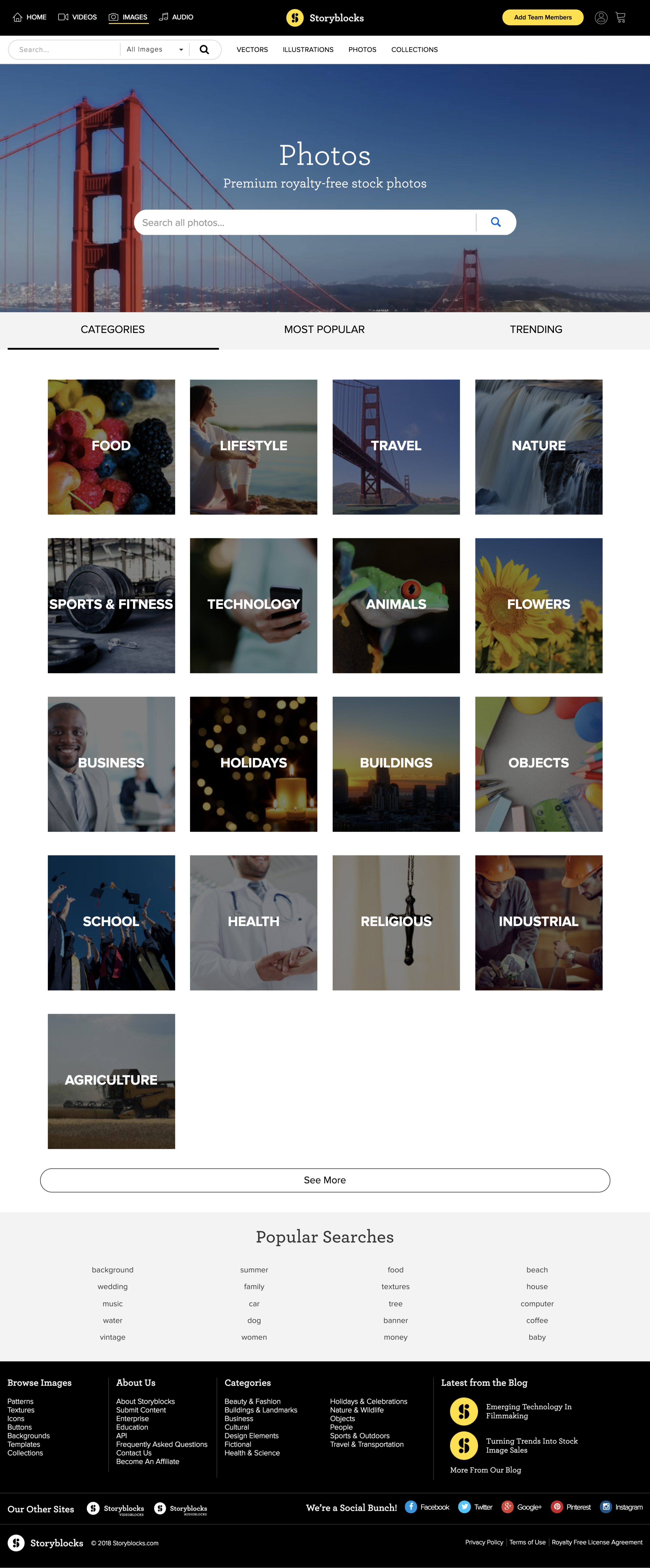
Category and Sub-Category pages can be a goldmine for SEO—and ours were lacking sorely. A lackluster H1, a leaky search bar that leads you away from the browsing experience, tabs that show our lesser than content, and almost no copy make for a poor performing page that follows almost no best-practices in SEO page ranking strategy.
The numbers are even so low that going into this AB test, we're so confident in our new designs that we're going to run this test as an 80/20 (with the main downfall being that it takes longer to reach stat sig with this method).
But nonetheless, we still get traffic to these pages. In fact, for the year of 2017 they make up 4.47% of all landing page sessions and 3.95% of visitors land on them. That's hundreds of thousands of potential new users. And a lot of cash if you do it right.
This just in. Old designs are old.
The Solution
So, they want me to design a new category page that not only improves Google page rank, boosts organic traffic, and increases visitor conversion rates, but also enhances the overall customer experience? Sounds like a business case to me.
The SEO team gave me a list of requirements:
- Text blocks and links
- Related content
- Trending content
- Value prop
- Links to blog posts
Easy enough. But this time I wanted to approach the problem a little differently. Along with my usual competitor and industry analysis, I wanted to use a specific Design Thinking technique I learned at an IBM workshop during DC Design Week to really make sure we were solving all the relevant problems.
The Research
Design Thinking is more than just a buzz word. It's a process designers can use to not only make sure they are fully understanding their user and the problem they are trying to solve; it's also a good way to shake the nerves before starting a new assignment. Does anyone else get pre-design jitters? Here's how I break it down thanks to an IBM workshop I attended a few months ago.
Observe. Reflect. Make. Repeat.
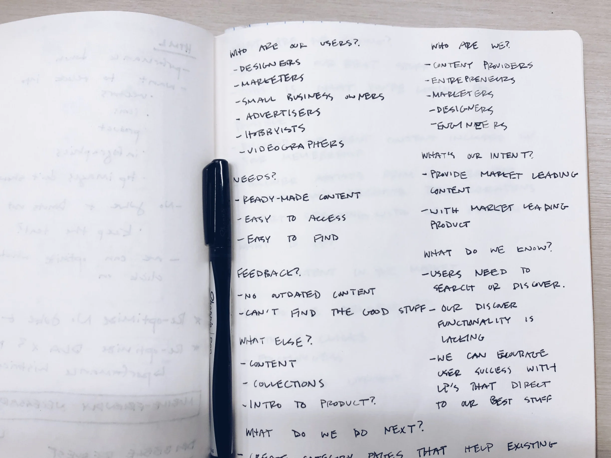
This is where I get it on paper. Ask myself the real questions. Start brainstorming.
Observe. Who are our users? What are their needs? What’s their feedback? What else is out there?
Reflect. Who are we? What’s our intent? What do we know? What do we do next?
Make. What are we saying? What’s possible? What is it? How do we deliver it?
Get it out on paper. It synthesizes differently than when trapped in your brain.
Establish Intention
Here comes a simple statement of intent that boils down all the previous brainstorming into a condensed statement. It took a few tries but felt right pretty quickly. I love how brainstorming seems to synthesize solutions in your subconscious.
"How might we enrich our category pages for our users in order to surface our best content, boost SEO value, and increase conversions?"
Empathy Mapping
Empathy is an area that's new to the business world, yet inherent in what designers set out to do. You must care about your users if you're ever to create a product they not only will use but enjoy using. I'm a fan of this exercise because you get to play pretend for a moment.
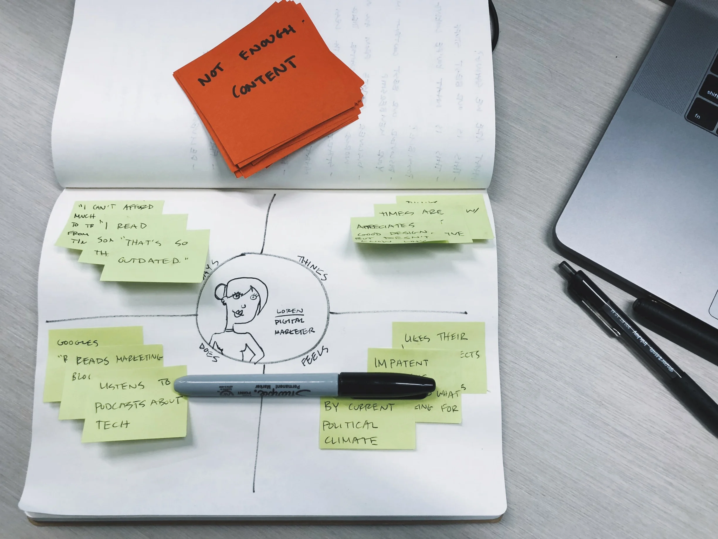
I chose a target user—Loren, a Digital Marketer—and took a moment to get into her head. What does she say? Think? Do? Feel?
Even unrelated to work. Maybe it's about her personal life or about the recent political climate. Here I took a moment to understand Loren and empathize with her worries, fears, and hopes.
Loren has feelings too.
State the obstacles and Group Them
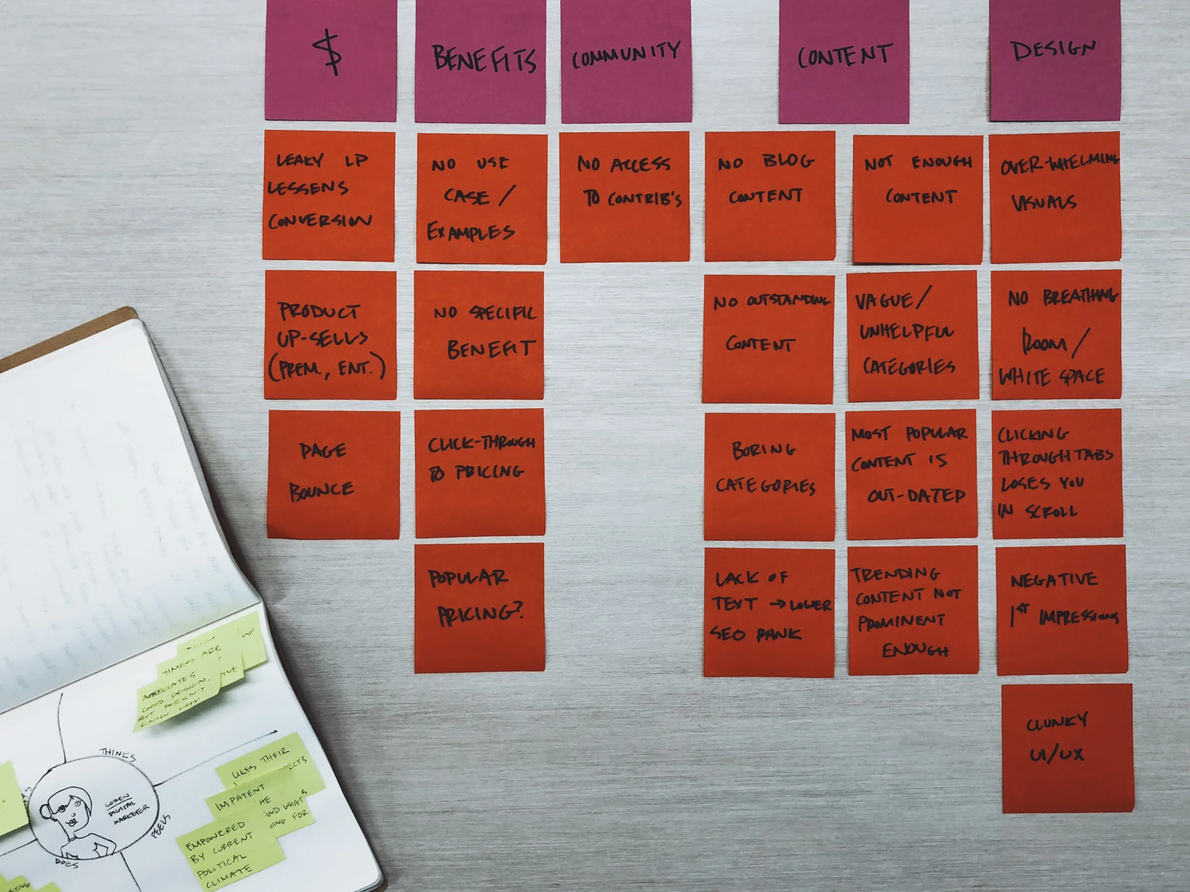
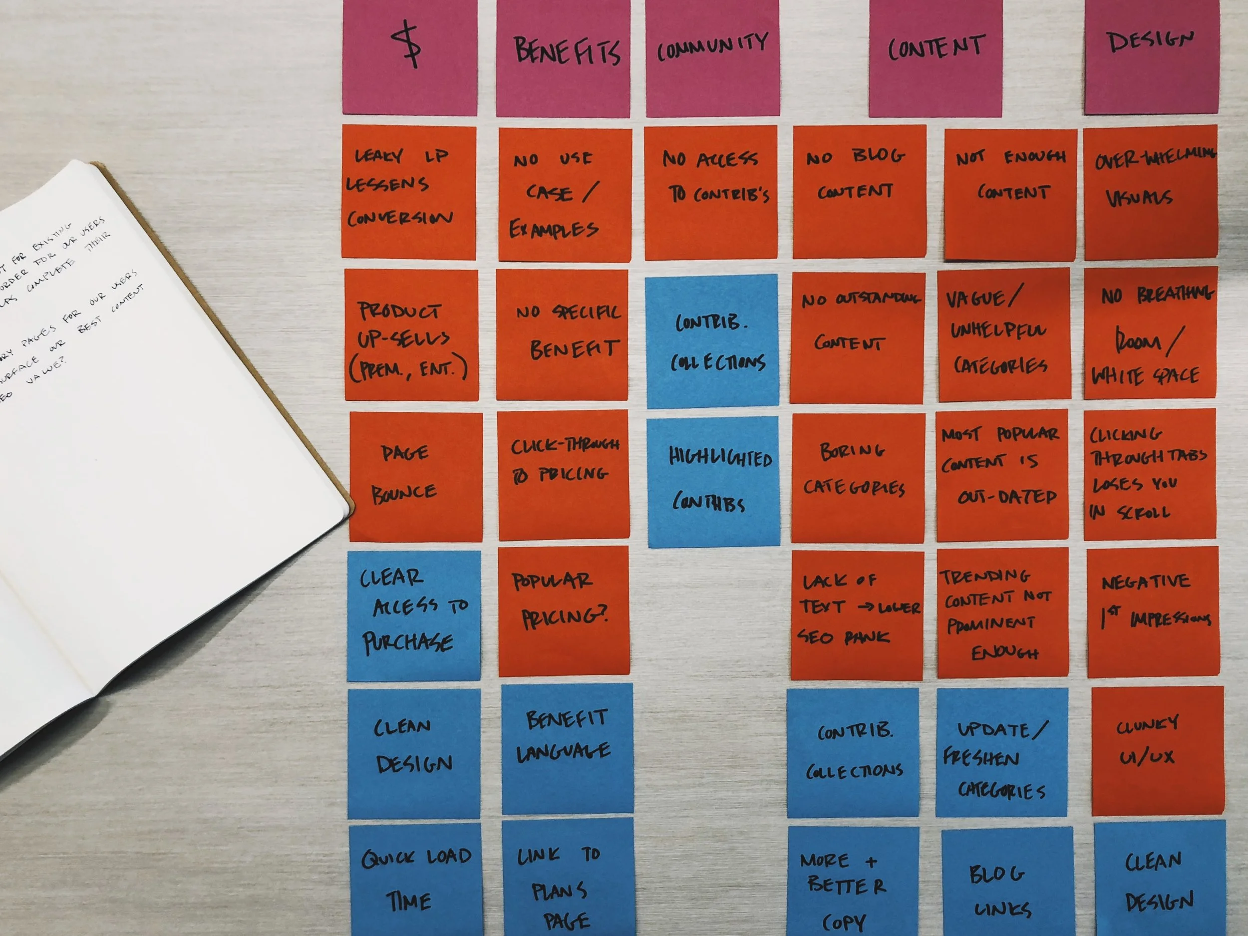
Once I felt like I not only knew what we were dealing with, what we set out to accomplish, and who we were doing this for, it was time to start listing out the challenges via good old-fashioned sticky notes.
This was meant to be done quickly. A brain dump of sorts. So I started complaining about the page as it exists in a way. The design is boring and dark. There is no copy. Our community value is displayed nowhere. Etc.
And I grouped them.
A few themes had started to emerge. Design was obviously an issue. Content was an even bigger one. As well as community, benefits, and cash.
And then I realized that Loren's thoughts and feelings coincided with these problems too. She might be tight on cash, but her work always comes first. She might notice problems with the design because she keeps up with podcasts. She may not do it herself, but she can call it out when its bad.
Don't Just Complain. Solve It.
Okay, so we get it now. This page had a problem—err, problems. Next step is starting thinking of ways to solve 'em. Sticky notes to the rescue again!
Turns out our problems not only fit nicely into themes of the challenges, but also tend to repeat themselves. For example, the solution of a cleaner design showed up in the Design challenge (obviously) and also the Cash challenge.
The satisfaction of lining up colorful stickies is palpable.
Prioritize
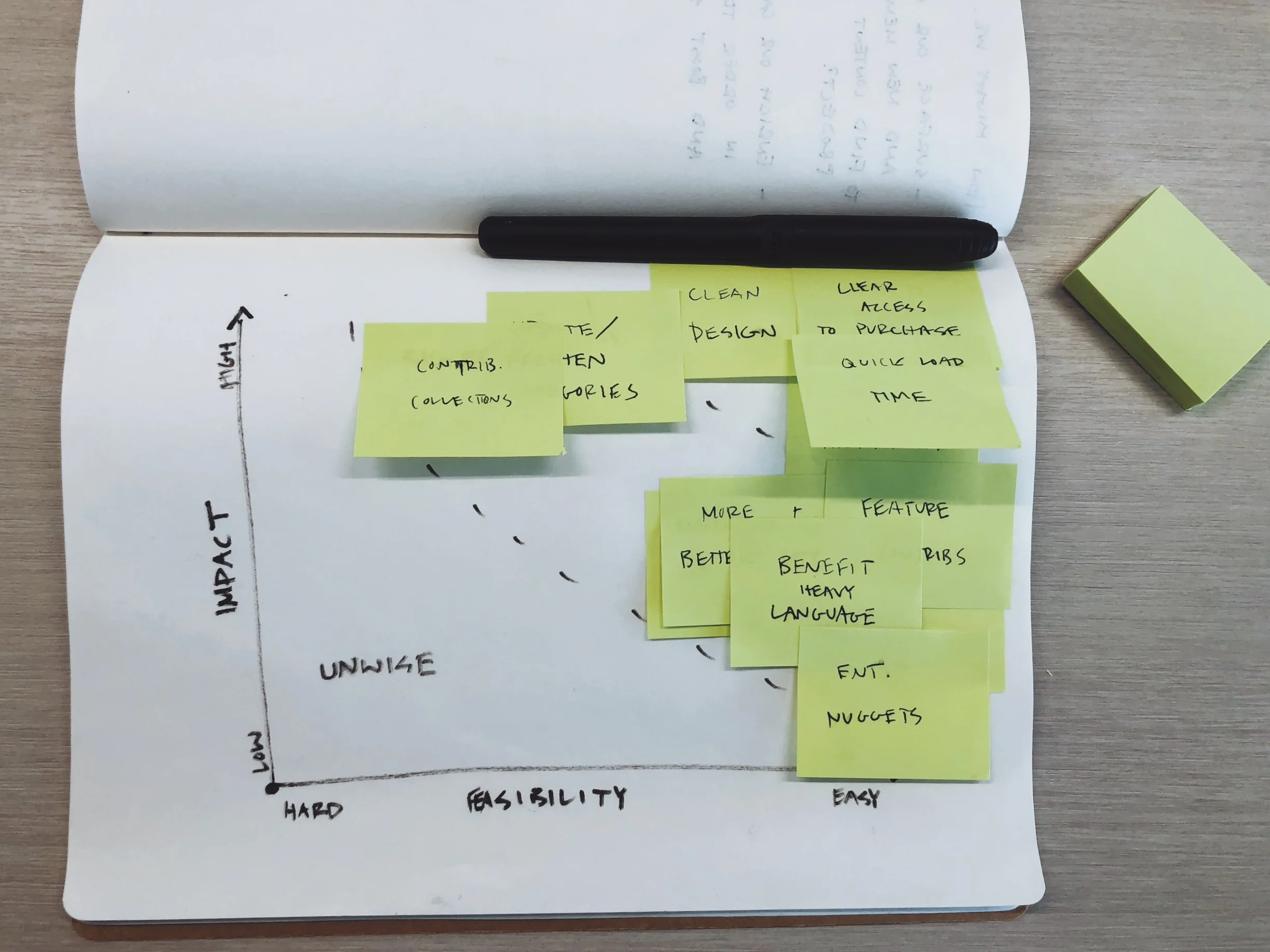
I have to say, working at a company that puts such a strong emphasis on data and business objectives has been good for me. Being a naturally passionate and feelings-oriented person, it was an initial struggle to learn to speak their language—or as I like to call it "fancy-pants business talk." But I've learned how important it can be to prioritize projects based on their impact.
That's what I did next. There is this awesome graph that forces you to chart out the importance of an action based on its impact and also its feasibility. Luckily, I learned that none of my ideas to solve the problem were unwise per se, but some less sexy ideas (like a quick load time) became a higher priority than something really exciting to me that would involve a lot of engineers and a lot of the company's time (like an entirely new functionality such as contributor collections).
Time to make the tough choices with prioritization.
The Design
All that seems like a lot of work for such a simple assignment. And I thought so too. But in an afternoon I was able to think through the problem from a multitude of angles and feel confident that I'd considered all the viewpoints.
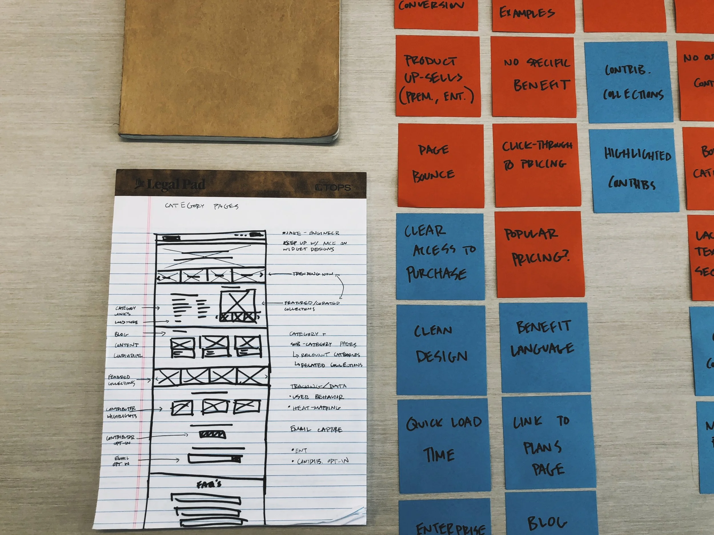
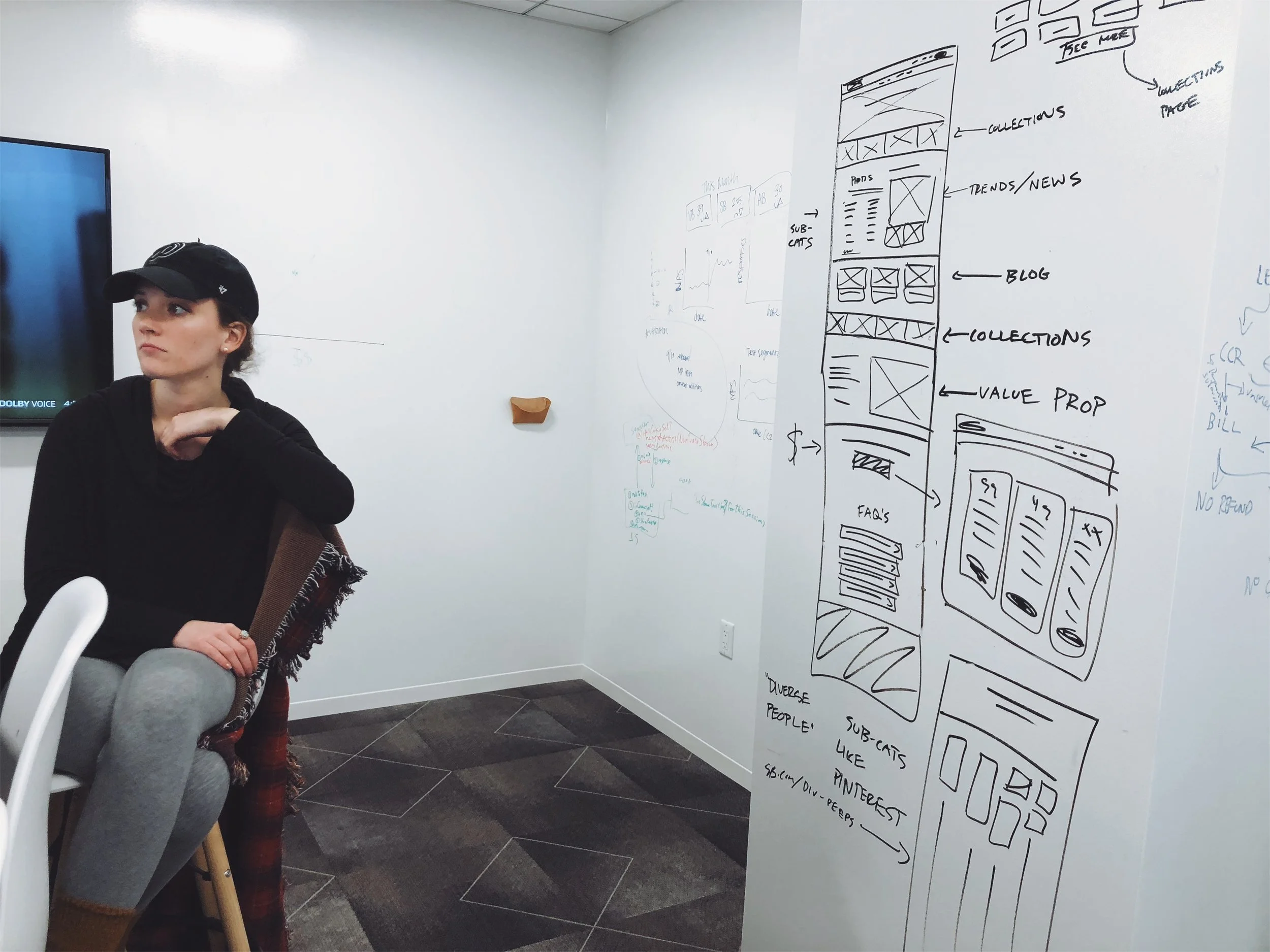
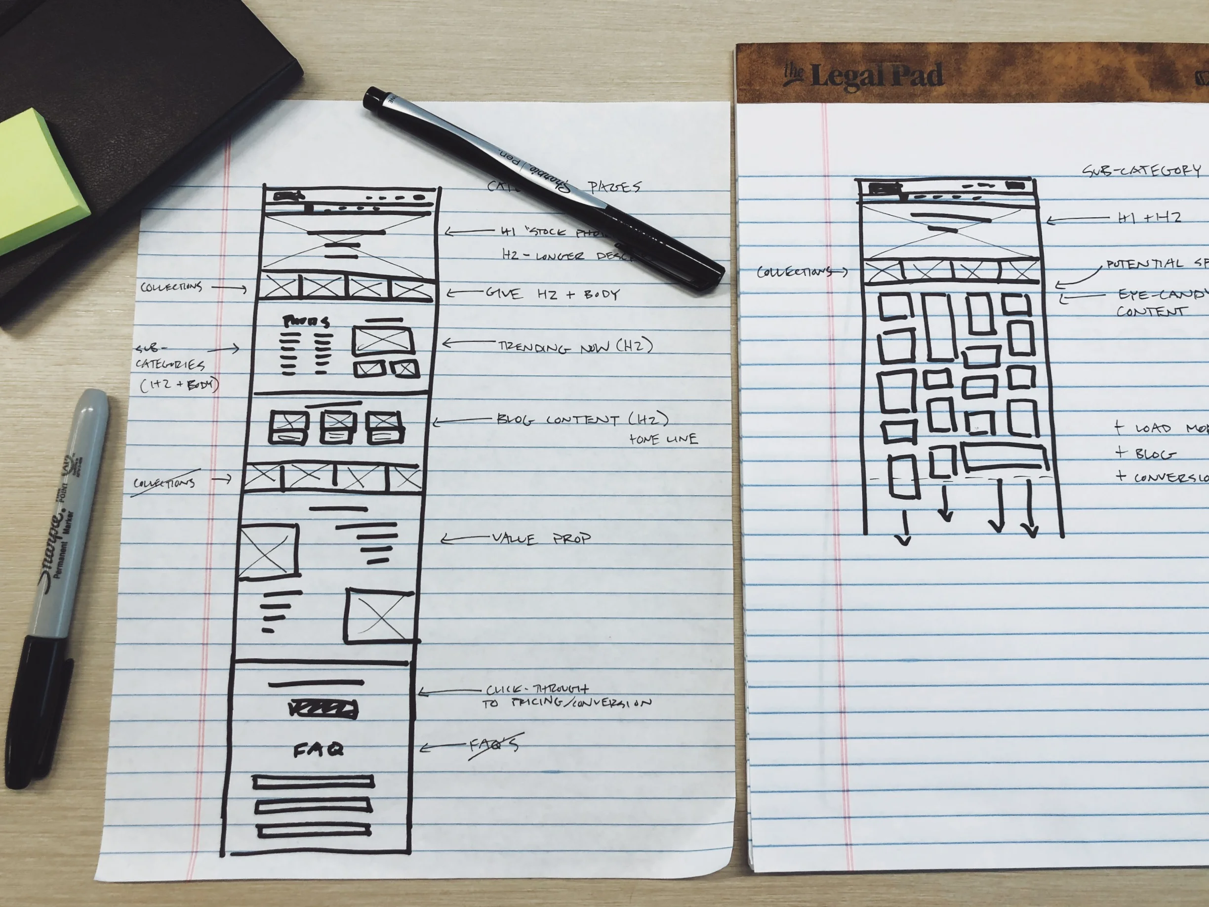
It was time to wireframe, consult my fellow designers, and share with the stakeholders (the SEO team) to refine it.
And this, my friends, is why the final mockups were so easy to complete. When it was time to pull up Sketch and get those gray boxes populating the screen, I knew what I was doing. And it didn't mean it was finalized in that moment. I still had some adjustments to make when I was able to see how the page would behave with actual content.
Turns out we wanted to lead with the most obvious point of the page: accessing stock media. So we moved the collection gallery below. And it gave a more natural weight to the page. Something you might not realize until images and copy make it on the page.
Now the designs are ready to send to engineering. And we can get it out into the world, gather some data, and repeat. I'm not sure I've ever relished in my profession as much as I am right now. What an amazing thing I get to do.
EDIT: 3 days into the AB test, we've reached stat sig on a 275% conversion lift! That's a potential high six-figure to seven-figure business impact for the year! Design Thinking for the win.
Check out the final design mockups here.
Like what you see? I'm always open to new opportunities to grow and challenge myself. Please don't hesitate to reach out.

