Sandboxx
Overview
In my time at Sandboxx, we’ve worked on a variety of projects for our app on iOS, Android, and Web platforms. As the team’s first design hire, there has been a lot of ground to cover including creating a new design system, establishing a method for engineer and design handoff, file management, user experience research, brand expansion, and dozens of redesign projects for new features, old features, and marketing assets.
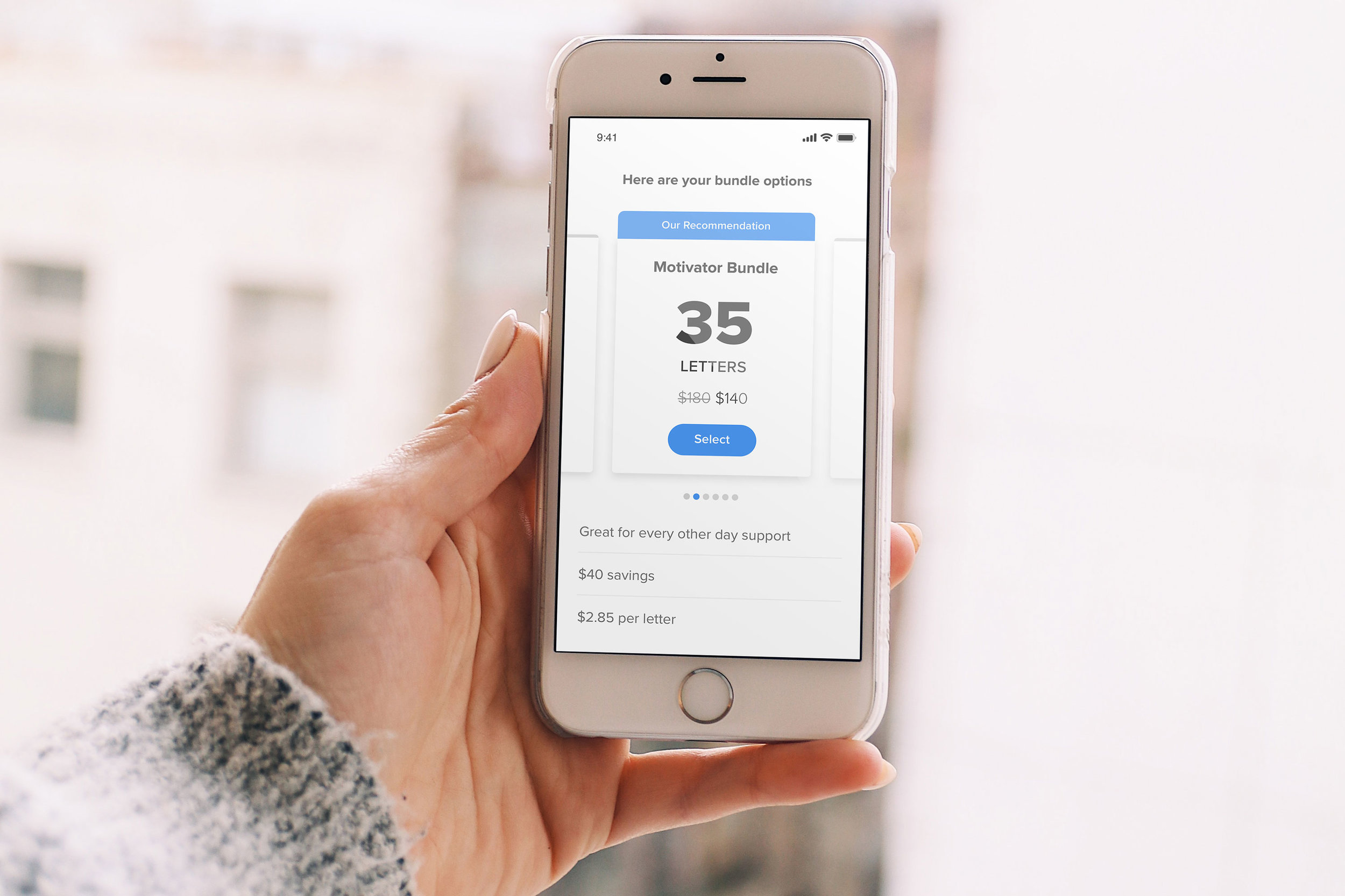
The following is just a sample of some of the many user interfaces I’ve designed. Case studies to come. Read more about some research and process in this Medium article.
A peek Behind the Curtains
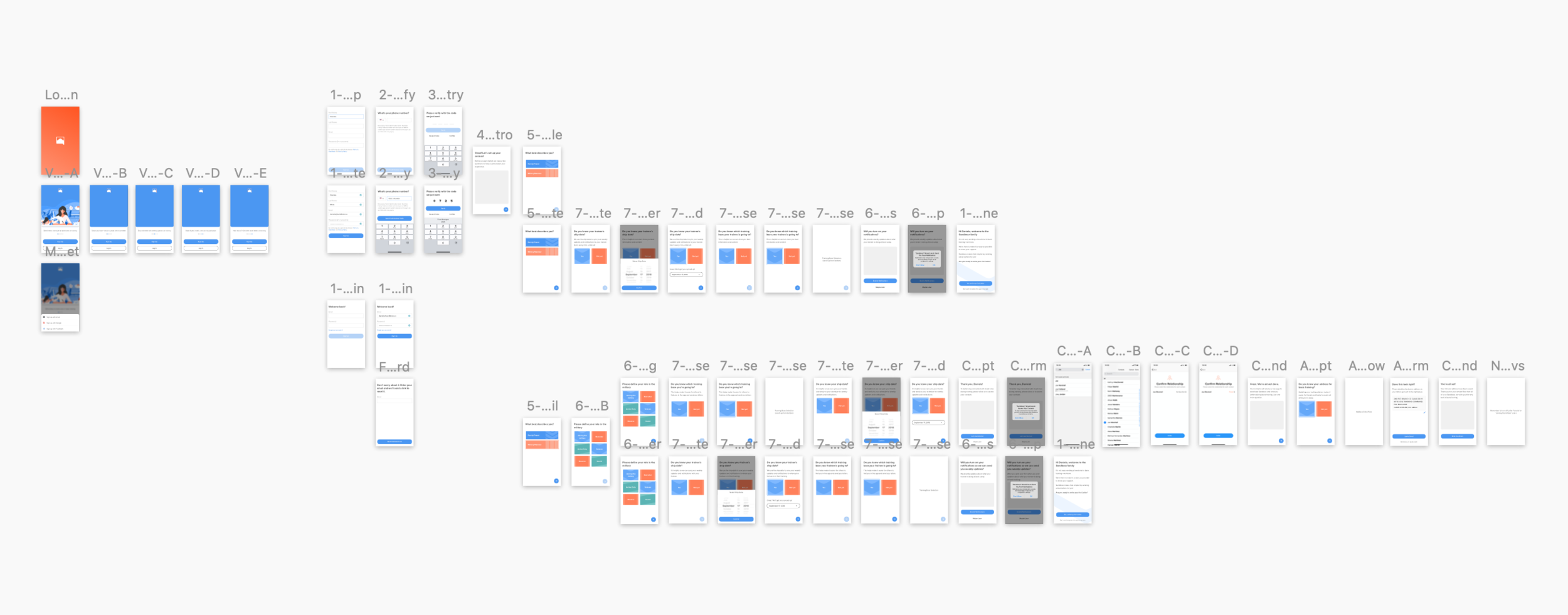
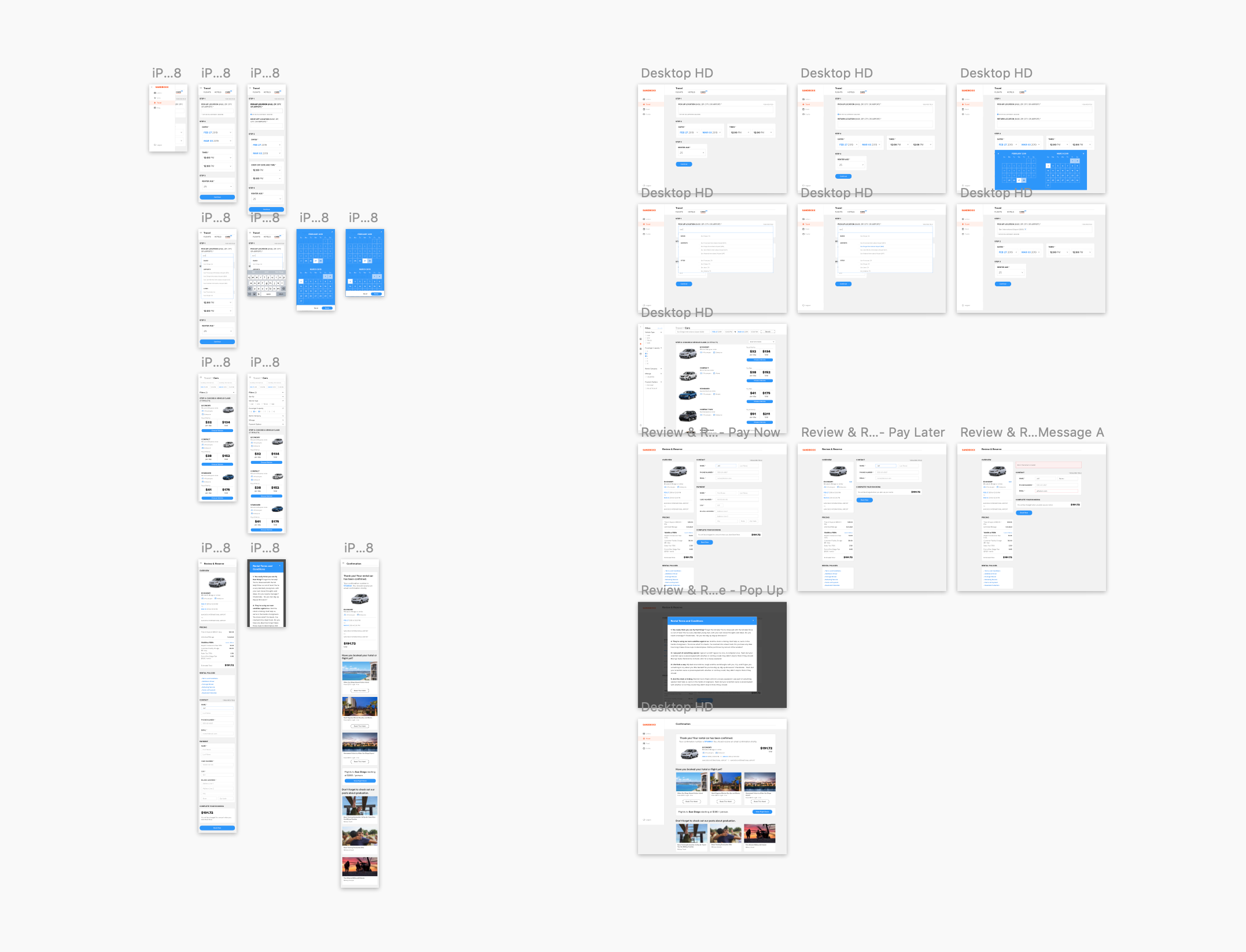
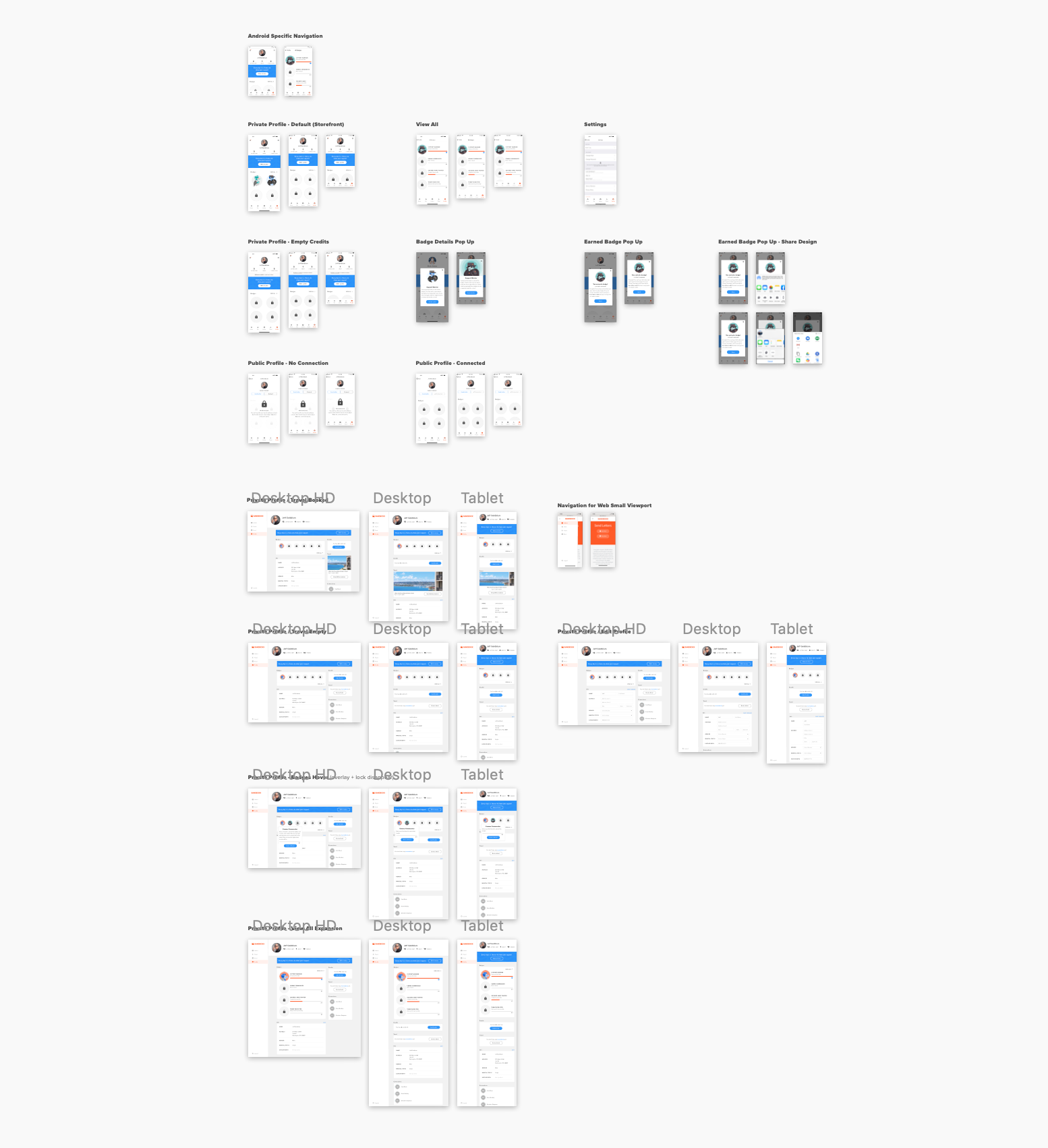
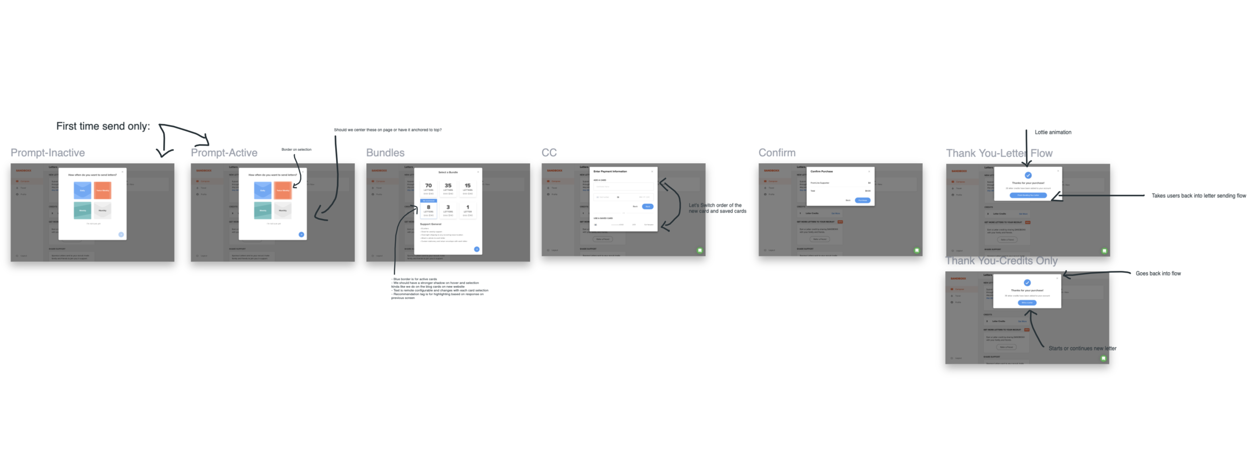
I keep my artboards and layers organized, symboled, and maintain a neat and useful library composed of color layers, text styles, components, and icons. My approach to our design system at Sandboxx has been project-based. I set up the basics and as a UI calls for it, I explore what components best accomplish solving our users’ needs—I revisit past decisions when I run into roadblocks.
I believe design systems are meant to empower creativity, not hinder it.
Below is a sampling of some of my flow and organization.


